925 #1
Here we go, and with this, I shall start my new comic!
When I started as a cashier some 10 years ago, I was almost too enthusiastic, I honestly thought that people actually cared that I was there to help. ::sigh:: good times.
Comments (10)
most do, it's just the pricks that make it seem otherwise. 13yrs of retail here
Hmm... my image got smooshed, guess I'll fix that in the future.\r
in the meantime, the text goes:\r
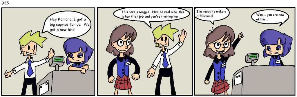
\r
Manager: Hey Ramona, I got a big suprise for ya. We got a new hire!\r
\r
Manager: This here's Maggie. Now be real nice, this is her first job and you're training her.\r
\r
Maggie: I'm ready to make a difference!\r
\r
Ramona: Wow... you are new at this...
:lol: \r
The site software is going to reduce the image size so it fits in the blog area. While not usually a big deal for photos, it will be for text.\r
\r
The reduction also loses some of the shading you have in there.\r
\r
I can offer two suggestions:\r
\r
The first is storing the originals on an image site like photobucket and add a link in the blog right below where you load it in your blog.\r
\r
The second suggestion is to make the layout a 2x2 grid instead of 1x4. This will have a tall rectangle shape overall instead of a wide rectangle.\r
\r
Either way the other thing you could do is always use a larger font size. You may need more space for the speech balloons but the backgrounds are usually wasted space anyway.\r
\r
Way to go!\r
Sorry, 1x3 not 1x4. You may need to adjust to a taller rectangle rather than each one being square.